

Stock Market returns

You don't get average.
You get what you get, unique to your time and place.
"Average" is a very dangerous idea in financial planning.
This is the time of year financial companies display a "quilt," or "periodic table" chart. It displays from top to bottom, each year, the asset class that did best to worst.
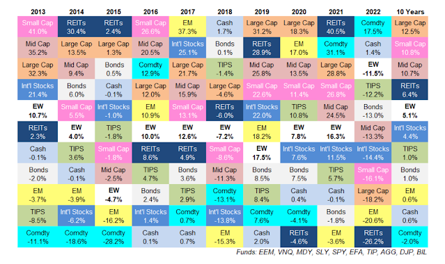
The categories are small, mid-size, and large companies, large international companies, emerging markets, cash, 10-year bonds, TIP treasury inflation-linked bonds. Commodities include oil. EW means an equal weight of the 10 other asset classes.
People examine the fluctuations and look to see a pattern. Does outperformance one year mean reversion to average, or even the bottom, the next year? Or do you hang onto winners another year, or go for whatever was worst, hoping for a rebound?
The column on the right is a 10-year summary. It shows that over that period stocks did the best. But notice something. Commodities--metals and oil--hugged the bottom for most of the decade and ended up the worst asset class overall. But maybe that was a matter of particular circumstance. It was a period of low inflation and high production of oil from the Middle East and Russia. Fossil fuel companies got a reputation as a dying industry, which persisted through the Obama and Trump presidencies. But then notice the past two years. Oil and other commodity companies have been the best asset class at exactly the time Biden was supposedly hostile to them and putting them out of business. Just about the time one was sure oil was a sure loser, it wasn't.
See if you can find a pattern of winners and losers, and a strategy for profiting from your insight. If you despair of finding a pattern, at least you have a 10-year history: Go with stocks. Ten years is a lot of history, and so that must be a good bet.
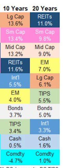
But wait. This next chart is a 20-year chart. It turns out that the strong performance of stocks was time dependent to the period 2012-2022.
To make it easier to read, here is an enlarged version of the first 10 years, 2000 to 2010.
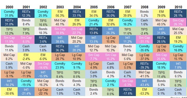
The period started with a disastrous period for stocks, with them losing value every year for three years. NASDAQ technology stocks lost over 80% of their value in those three years; the SP500 lost half its value. Over the full 20-year period stocks were not the best. Real Estate Investment Trusts were. And in the first 10 years, commodities were in favor, not out of favor. The summary results for both 10 years and 20 years are here:
Humans do not get average returns during a period a person spends from capital accumulated over a lifetime. A person born in 1942 turns 65 exactly once, in 2007. A person gets what one gets, in this case the Great Financial Crisis. Investments plummeted. However, an investor born in 1950, who retired in 2015, lucked into a six-year bull market, and was very fortunate indeed. It isn't fair and equal. Different times, different experiences.
In explaining the time-dependency of circumstances to clients I cited how very different were the life experiences of men born in 1920 from men born in 1940. The man born in 1920, faced near-universal military service into World War II and a substantial chance of getting killed. A man born in 1940 was too young for Korea and too old for Vietnam. An average isn't meaningful. We each get our own moment.
Average is a deceptive idea to anchor in mind. During a long accumulation phase of life, average is a useful idea if taken with a grain of salt. But when spending from those assets one needs to survive whatever life happens to throw at you. It won’t be average.